
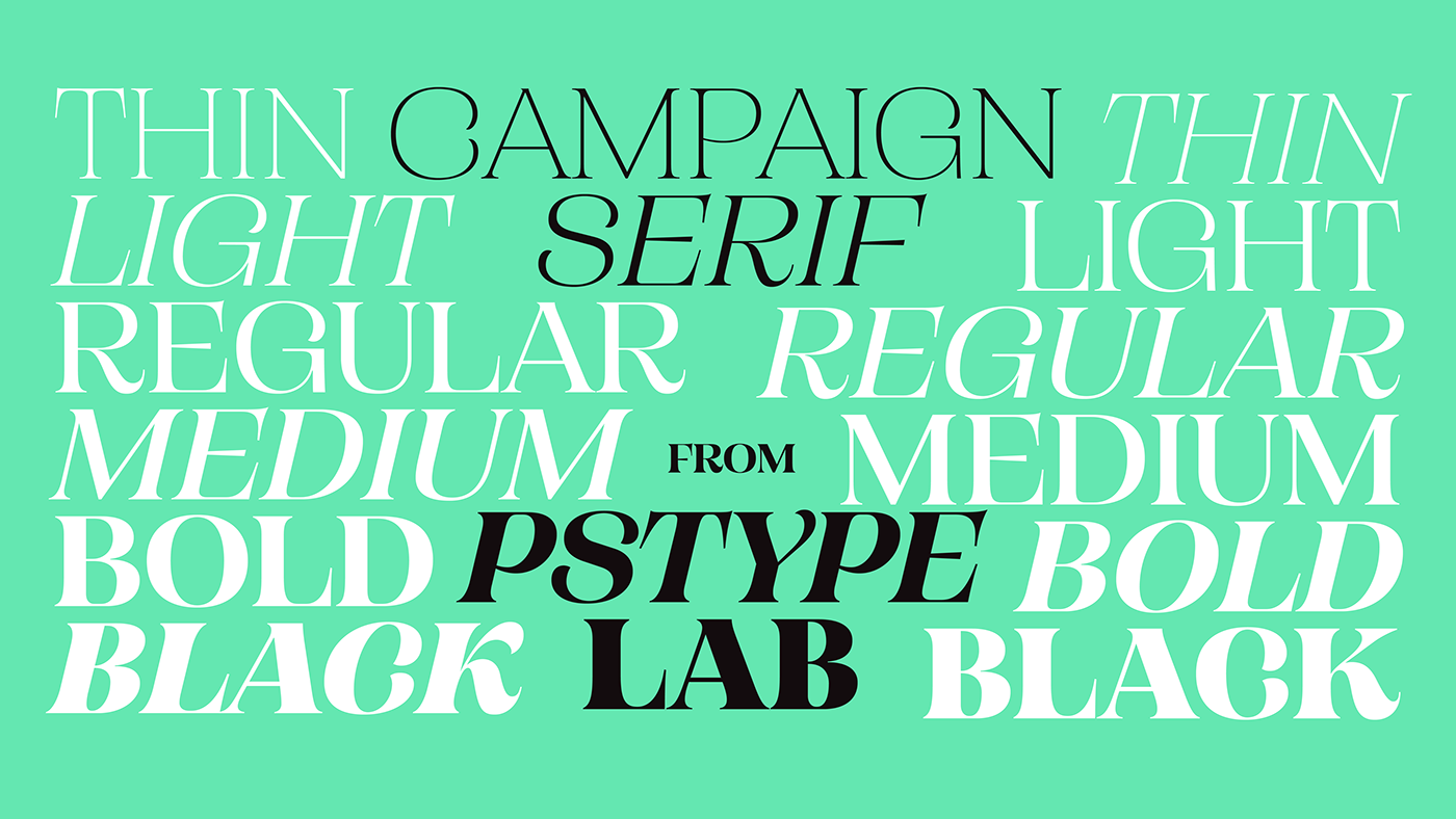
Campaign Serif is now Available! Grab the full family Here.

Campaign Serif: The latest in the Campaign Family borrows traits from the Grotesk but allows itself to shift when needed and stray where necessary. Below is a comparison between the Grotesk, Slab and Serif. Maintaining the wide proportions and exuberant curves, the subtly curved terminals became a more exaggerated crescent shape in the serif family. The looping 'k' was a feature in the grotesk and the serif glyph remains a feature with it's unique construction.

Detail of the roman and italic 'k'.

The unique form of the 'k' worked well in the heavier weights but in the lighter styles felt a bit awkward. Instead of forcing them to be the same, a form change was implemented.


Image created with https://www.fontspecimen.com


